


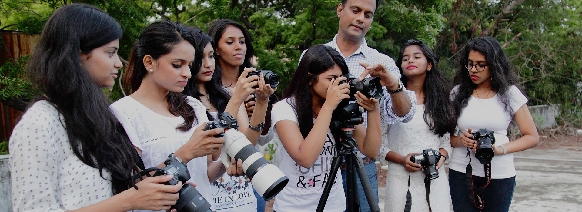
Mentored by Ace Photographer
Karthik Srinivasan

Mentored by Ace Photographer
Karthik Srinivasan
Mentored by Ace Photographer

Mentored by Ace Photographer
Mentored by Ace Photographer
Mentored by Ace Photographer
Posted on: May 16, 2017 at 2:57 am


Photographers take radically different approaches when making color images vs BW images. Its not as simple as converting a color image into BW during post process. When composing BW images, the tonal values of the elements within the frame are all that matter as far as contrast is concerned. But we will have another article on that later. For now, lets look at color.
How do photographers select the colors that their models are to wear? Color, along with form and texture are key elements to posing your models. To be able to select the right colors, a basic idea of color theory is essential. Our students at KAPA learn that in detail, but we’ll explain it a little here. ‘Primary’ colors are those which you can never get by mixing other colors. Conversely, primary colors are those, which when mixed in varying quantities can give you all other colors. In electronic visual displays, red, green and blue are considered primary colors (RGB).
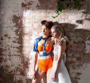
Check out this fashion image by Karthik Srinivasan. The colors worn by the models are Blue and Orange, which is close to Red in the color spectrum. The green in the leaves adds a third primary color within this composition, giving the image strong color saturation. This is not to say that every successful color image need have all three primary colors. Form and texture enhance the identity of a photograph as well, as do complimentary colors (more on that later).