

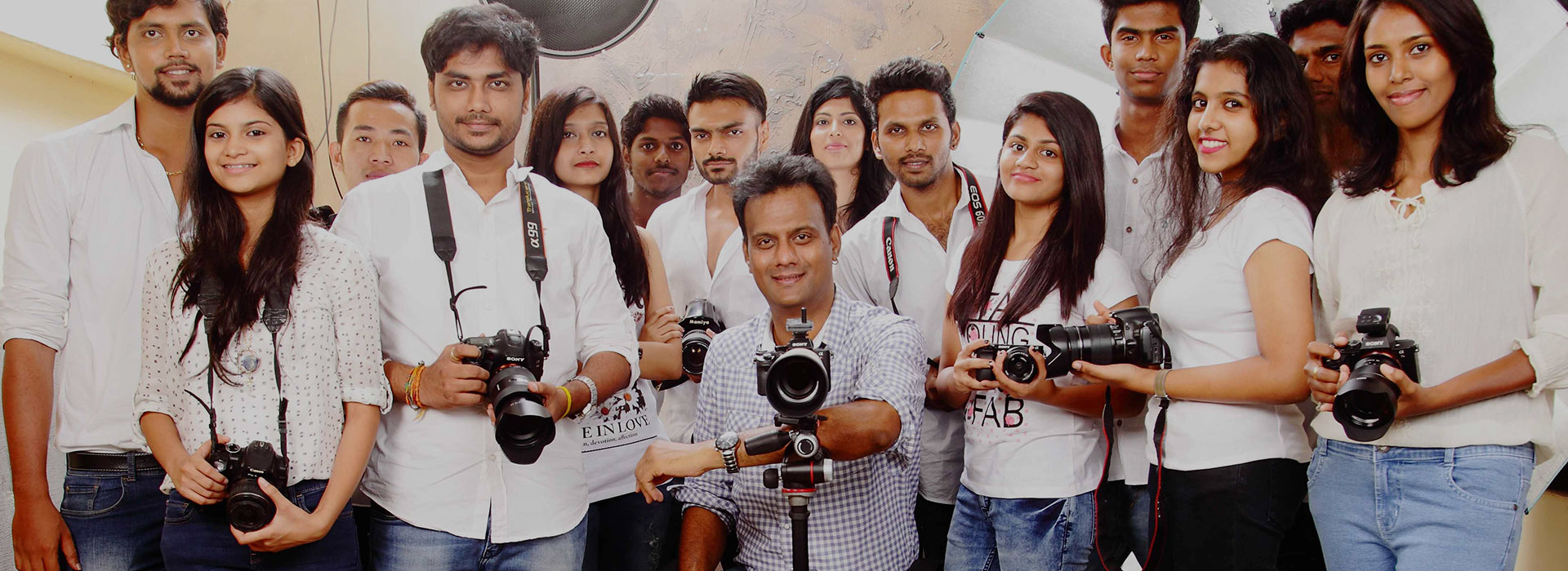
Mentored by Ace Photographer
Karthik Srinivasan
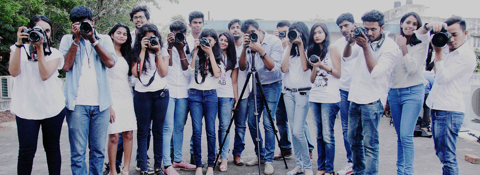
Mentored by Ace Photographer
Karthik Srinivasan
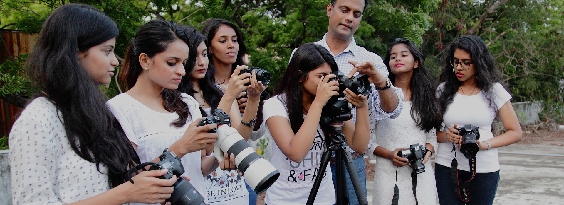
Mentored by Ace Photographer

Mentored by Ace Photographer
Mentored by Ace Photographer
Mentored by Ace Photographer
Posted on: June 2, 2017 at 5:00 am


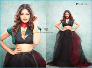
Have you ever given thought to the choice of background color that fashion photographers use? Usually it needs to compliment the colors worn by the model. Usually contrast is preferred…a little knowledge about the color triangle helps here.
This is the color triangle –
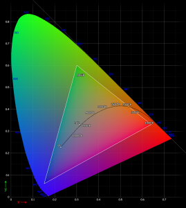
As you can see, it is a gamut (or range) of colors of the spectrum, blending into each other within a triangular area, with the three primary colors Red, Green and Blue at the corners of the triangle. These three colors are referred to as the primary colors in the digital media, because all other colors can be derived from using a combination of these three. This is the principle that the color TV works on, as does your CRT or LCD or TFT monitor. It is also how the manual color processing and printing of photo negatives worked.
Coming back to our topic of color selection for model clothing vs background, as you can see from the triangle, every corner of the triangle (or every primary color), has an opposite side to it. The center of this opposite side is the color MOST complimentary or MOST OPPOSITE to that primary color. For Red, it is Cyan, for Green it is Magenta and for Blue, the opposite is yellow.
Now, look at the fashion image we’ve featured in this post…model Sanchita Shetty has been beautifully photographed by Kapa Mentor Karthik Srinivasan (Sony a7RII with SAL 70-200mm (1/125sec, f/11, ISO 200). One of the elements of the image that strikes the viewer first is the presence of the color red on the neck. Now compare this to the background color using our color triangle. While the background may not always be the EXACT opposite color to the subject, somewhere close to that center of the opposite side to a primary color in the triangle, works to create color contrast. Its pretty simple if you can remember the two sets RGB and CMY (Red Green Blue/ Cyan Magenta Yellow). Try and look for complimentary colors when you shoot next!